
FireTeam
Creating A
Startup's First
Website
Overview
FireTeam is a startup looking for seed funding. Our agreement was to provide user experience consulting and user interface design to create the company’s first website to promoting their fitness program designed for teams of military veterans.
Outcome
FireTeam won $15,000 and 1st place in a University of Texas Startup Accelerator competition using our final prototype in their presentation.
My Role
UI Designer
Duration
2.5 Weeks
Design Process
1
Research
2
Ideation
3
Design
4
Deliver
• Final Responsive
Prototype
• Client Presentation
• LoFi Prototype
• Mid-Fidelity Prototype
• Site Map
• Style Guide
• HiFi Prototype
• A/B Testing
• User Testing
• Persona
• User Insight
• Value Proposition
• Storyboard
• User Journey Map
• Client Interviews
• User Interviews
• User Survey
• Proto-persona
• Competitor Analysis
• Affinity Diagram
• Empathy Map
Learning To Understand The Client
FireTeam is looking to create a holistic health app for teams of military veterans. The company believes that by using existing teams it can help restore users’ social bonds and physical fitness which will empower users to improve their physical, social, and emotional health. In its initial stage of development access to the FireTeam app will be restricted to veterans registering as teams.
Client's Short Term Needs
Recruit Investors
Develop Mobile App
Create User Community
Client's Long Term Needs
Develop a technology that enriches the physical, mental, and emotional lives of veterans and first responders.
Create a sense of purpose for veterans and first responders that supports holistic health in their community.

Learning To Understand The User
408
5
Veterans Surveyed
Veterans Interviewed
Our Assumptions
-
Male
-
Likes sports and the outdoors
-
Resistant to help
-
Dealing with PTSD & other mental illness
Reality
-
Women almost 20% of the veteran community
-
Respondents completely rejected any language suggested they need to be 'fixed'
-
They do like sports
Our User
For our design decisions to remain rooted in the information we gained from our users we created a target persona. Our target user is a 27-year-old high school teacher who feels isolated from friends and has trouble making new relationships.

Prototyping

Low Fidelity
We created early sketches and a low fidelity prototype to better understand how to layout the site content and to gather user feedback.
User Testing
We tested users' ability to identify the following elements on the site.
The Brand
40%
Successful
Purpose of the Site
80%
Successful
Navigation
70%
Successful
Iterating

“I know it’s about teams but that’s about it.”
user response

Users found the slogan Team 4 Life distracted from the brand name and the call to action. We removed the slogan, added a logo and made the call to action button more prominent.

We removed the torn edge and added color to highlight the brand and allow the visuals to stand on their own. We removed the phrase "team only fitness" because it did not resonate with users coming to the site for the first time.
Showcasing an
Unfinished Product
FireTeam had developed its business plan but had not yet developed its app. We needed to show investors the potential of the app via our website. This meant we also had to consider what a finished app might look like without committing Fireteam to any particular functionality. We developed a personal dashboard and an exercise timer to help site users imagine the app's possibilities.


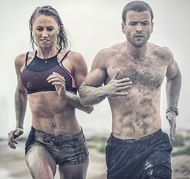
Finding The Right Tone

The client presented us with a diverse list of companies they cited as inspirations for their product.
Some of the branding they suggested we replicate included combat imagery. We were uncertain about this direction so we user-tested multiple image combinations with users who roughy matched our persona.
Based on the data collected there was a preference for photos with militrary training, but not combat imagery. We adjusted our design accordingly.
79%
Preferred military training imagery to non-military training imagery
62%
Preferred non-combat imagery to combat imagery
64%
Prefered ‘rugged’ imagery to ‘sleek’ imagery
High Fidelity Prototype

Core Objectives
For our final prototype, we wanted to make sure we had accomplished three main objectives.
-
Create a look consistent with the user's self-image
-
Provide FireTeam with a minimally viable site that could be used in its existing form and built out with additional functionality in future versions
-
Clearly represent the product
Core Decisions
-
Due to time constraints, we decided not to dedicate any resources to onboarding or the account creation process. Because the product has not been finished we did not believe we could predict all the requirements need to do a good job on these elements and devoting attention to them only detracted from our ability to highlight the concept for investors
-
We used images that were more aggressive than we were comfortable with initially as a design team and less aggressive than the client had initially envisioned because it was what our user data told us was the best fit
-
We focused on empowering and collaborative language to describe the product rather than precise technical descriptions because we felt it was important to focus on the brand value of a group experience rather than elite performance
View Prototype
Lessons Learned

-
There's more than one understanding of the problem: A client, their users, and a design team will all see a problem in different ways.
-
Fresh eyes don't last long: The more you work on a design the less you related to a person seeing the design for the first time.
-
Less is more: Creating a minimally viable product is more difficult than imagining many bells and whistles.
-
Style and tone are subjective: Design decision should be based on research and strategic alignment.